You can use theme settings to make changes to your online store's typography, colors, social media links, and cart page. When you make changes in your theme settings, the changes apply to your entire online store.
Find the theme that you want to edit, and then tap Customize.
Tap …, and then tap Theme settings.
Tap Colors.
In the Schemes section, tap an existing scheme or tap Add Scheme to add a new color scheme.
To edit the color scheme, tap the color swatch to change the following content type colors:
Background
Background gradient
Text
Solid button background
Solid button label
Outline button
Shadow
To set your color, enter a hex color code or choose the color from the color picker. To set the color to transparent, delete the hex color code from the text field.
Tap Done.
Tap ✓.
Typography
You can set the font style and size for the text on your online store. You can choose a system font or a custom font.
Consider using system fonts on your store, because system fonts are already installed on a user's computer. Using system fonts avoids downloading new fonts to your customer's computer, which can negatively impact your store's loading speed. The font that displays on your customer's computer depends on their operating system.
Find the theme that you want to edit, and then tap Customize.
Tap …, and then tap Theme settings.
Tap Typography.
To change a font type for your store's headings or body text, tap Change in the Headings or Body section.
Tap the name of the font that you want to use, and then tap Done.
Tap ✓.
Customize your font sizes
You can set the default font sizes for your headings and body text with the Typography theme setting.
The minimum font size is 100%, and the maximum font size is 150%. Each increment of the scale increases the font size by 5%. The default setting is 100%.
Find the theme that you want to edit, and then tap Customize.
Tap …, and then tap Theme settings.
Tap Layout.
Use the Page width range slider to choose a page width between 1000 px and 1600 px. The default setting is 1600 px.
Optional: Use the range slider to add vertical Space between template sections on your pages. You can add up to a maximum of 100 px between sections.
Optional: If you have a Grid layout, then use the Horizontal space and Vertical space range sliders to add space between grid content on your pages. Adding horizontal space will add a maximum of 40 px of space to the rows of content on your pages, whereas adding vertical space will add a maximum of 40 px of space to the columns of content on your pages.
Tap ✓.
Animations
Animations allow you to add movement and visual interest to your online store. You can activate a fade-in animation that reveals your store's sections on scroll, and a hover effect for your cards and buttons.
Find the theme that you want to edit, and then tap Customize.
Tap …, and then tap Theme settings.
Tap Animations.
Optional: To activate an animation that reveals your online store's sections on scroll, select Reveal sections on scroll.
Optional: To add a hover effect animation to your cards and buttons, select one of the following options from the Hover effect setting:
Vertical lift: When a customer hovers over a card or button, the element shifts upwards.
3D lift: When a customer hovers over a card or button, the element shifts forward, giving it a 3D effect. This also has a subtle shine that moves across the element, giving it another layer of dimension.
Tap ✓.
Borders and shadows
You can adjust the borders and shadows of some interactive content types, such as drawers, buttons, variant pills, or product quantity inputs.
Customizable options for borders are:
Thickness, which changes the outline of the item.
Opacity, which sets the visibility of the item outline.
Corner radius, which rounds the corners of your item.
Customizable options for shadows are:
Opacity, which changes the visibility of the item's shadow. A shadow opacity of 0% removes the item's shadow entirely.
Horizontal and Vertical offset range sliders, which move the location of the shadow around the item.
Blur range slider, which changes the opacity of the item's shadow.
Buttons
You can customize the settings for call to action buttons on your online store by adding shadows, changing the spacing or opacity, and adjusting the shape of your buttons.
Find the theme that you want to edit, and then tap Customize.
Tap …, and then tap Theme settings.
Tap Buttons.
Optional: Use the range slider to change the appearance of your button Border.
Optional: Use the range slider to change the button Shadow. Setting the shadow Opacity to 0% removes the shadow.
Tap ✓.
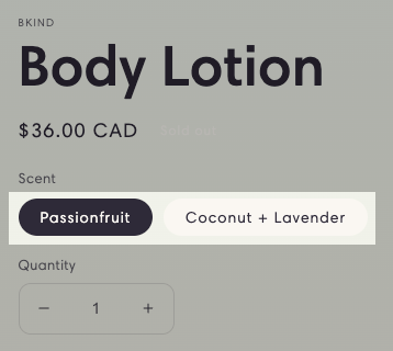
Variant pills
Variant pills allow you to display the variants of a product on a product page or a featured product section. Customers can select the desired variant to add the product to their cart without needing to change product pages. You can customize how your variant pills display on your online store.
Find the theme that you want to edit, and then tap Customize.
Tap …, and then tap Theme settings.
Tap Variant pills.
Optional: Use the range slider to change the appearance of your variant pill Border.
Optional: Use the range slider to change the variant pill Shadow. Setting the shadow Opacity to 0% removes the shadow.
Tap ✓.
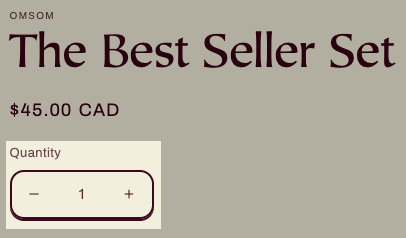
Inputs
Inputs are interactive areas that require customer input, for example, a quantity selector, an email signup form, or cart notes. You can adjust the appearance of your online store inputs.
Find the theme that you want to edit, and then tap Customize.
Tap …, and then tap Theme settings.
Tap Inputs.
Optional: Use the range slider to change the appearance of your input Border.
Optional: Use the range slider to change the input Shadow. Setting the shadow Opacity to 0% removes the shadow.
Tap ✓.
Cards
The settings for product cards, collection cards, and blog cards allow you to customize the style of each type of card when they're displayed in page sections. You can change the color, alignment, image padding, borders, and shadows of these three types of section card.
Find the theme that you want to edit, and then tap Customize.
Tap …, and then tap Theme settings.
Tap Product cards, Collection cards, or Blog cards.
To choose a card style, use the Style option.
Optional: To add space around your card images, use the Image padding range slider.
Optional: Choose between Left, Center (default), or Right for the Text alignment of your cards.
Optional: In the Color scheme section, tap Change. Select a color scheme for your cards, and then tap Done.
Optional: Use the range slider to change the appearance of your card Border.
Optional: Use the range slider to change the card Shadow. Setting the shadow Opacity to 0% removes the shadow.
Tap ✓.
Content containers
Containers are used for the text element of content sections, for example, the text box on a slideshow, on an image banner, or in the columns of multicolumn sections. You can customize the appearance of content containers for your online store.
Find the theme that you want to edit, and then tap Customize.
Tap …, and then tap Theme settings.
Tap Content containers.
Use the range slider to change the appearance of your content container Border.
Use the range slider to change the content container Shadow. Setting the shadow Opacity to 0% removes the shadow.
Tap ✓.
Media
Media is the visual component of sections, for example, product media or an image in the Image with text section. You can add borders and shadows to your media.
Find the theme that you want to edit, and then tap Customize.
Tap …, and then tap Theme settings.
Tap Dropdowns and pop-ups.
Use the range slider to change the appearance of your Border.
Use the range slider to change the Shadow. Setting the shadow Opacity to 0% removes the shadow.
Tap ✓.
Drawers
Drawers are hidden, interactive containers that display when tapped or clicked, such as a collapsible navigation menu or collection filter options. You can customize the border and shadow of the drawers on your online store.
Find the theme that you want to edit, and then tap Customize.
Tap …, and then tap Theme settings.
Tap Drawers.
Use the range slider to change the appearance of your drawer Border.
Use the range slider to change the drawer Shadow. Setting the shadow Opacity to 0% removes the shadow.
Tap ✓.
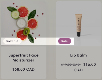
Badges
Sale and Sold out badges are automatically added to your product images when you reduce the price or when the inventory count reaches 0. You can adjust the position, shape, and color of your Sale and Sold out badges.
Page and Blog badges display in relevant search results. You can customize the position and shape of these badges, but you can't change the color of the Page and Blog badges.
Find the theme that you want to edit, and then tap Customize.
Tap …, and then tap Theme settings.
Tap Badges.
To select your badge position, tap the Position on cards drop-down menu, and then tap Bottom left, Bottom right, Top left, or Top right.
Optional: To add rounded corners to your badges, use the Corner radius range slider. Setting the corner radius to 0 px produces square badge edges, and increasing the radius makes the edges of the badge more rounded.
Optional: To select a color scheme, tap Change for the Sale badge color scheme or the Sold out badge color scheme. Select a color scheme for your badges, and then tap Done.
Tap ✓.
Brand information
You can include information about your brand on your online store. When you've completed the following steps, you can then add the Brand information block in your online store's footer.
Find the theme that you want to edit, and then tap Customize.
Tap …, and then tap Theme settings.
Tap Social media.
To add links to your social media accounts, enter the website addresses for your accounts in the relevant Social accounts fields. You need to enter full links, such as https://instagram.com/shopify or https://tiktok.com/@shopify.
Tap ✓.
Search behavior
Your online store includes predictive search, which displays suggestions when customers start typing into the search field. Search suggestions can help customers articulate and refine their search queries, and provide new ways for them to explore your online store. Search suggestions can also let customers quickly browse matches, without having to leave their current page to view a separate list of search results.
To learn more about how search suggestions work, refer to Predictive search.
You can customize how search suggestions display to your customers.
Find the theme that you want to edit, and then tap Customize.
Tap …, and then tap Theme settings.
Tap Currency format.
To display currency codes, select Show currency codes.
Tap ✓.
Cart
You can change the style of the cart on your online store. When a customer adds a product from your store to their cart, the cart can be displayed as a drawer, a page, or a pop-up notification. To keep the customer on the product page, use the drawer or pop-up notification option. To take the customer to the cart page, use the page option. When the customer's cart is empty, you can display a featured collection in the cart drawer.
Find the theme that you want to edit, and then tap Customize.
Tap …, and then tap Theme settings.
Tap Cart.
Select your Cart type from the Drawer, Page, or Popup notification options.
Optional: To display the vendors of the items in a customer's cart, select Show vendor.
Optional: To provide customers with a text box where they can enter special requests or add extra order information, select Enable cart note.
Optional: If you select Drawer as your Cart type, then you can display a collection in the cart drawer when it's empty:
In the Cart drawer area, tap Select collection.
Tap the name of the collection that you want to display, and then tap Done.
Optional: If you select Drawer as your Cart type, then you can change the color scheme of your cart drawer by taking the following steps:
In the Cart drawer > Color scheme area, tap Change.
Select a color scheme that you want to use for your cart drawer, and then tap Done.
Tap ✓.
Custom CSS
The Custom CSS section allows you to enter your own CSS code, for example to customize the appearance of your online store's buttons beyond the default settings that are available, or to apply unique styling to specific text elements.
Custom CSS in your theme settings affects all pages in your online store, except your checkout.
A theme style is a collection of settings chosen by a theme designer. You can apply a theme style to your store to give it a polished look and feel. All themes have a theme style applied by default. The other theme style options that you have depend on which theme you use.
When you customize a theme, you replace the theme style settings with your own. When you apply a theme style to your theme, you change your current settings, such as colors and typography.
Find the theme that you want to edit, and then tap Customize.
Tap …, and then tap Theme settings.
Tap Theme style.
Select the theme style that you want to use, and then tap Done.
Tap ✓.
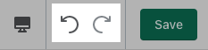
Undo and redo changes
The Undo button reverses your most recent change, and the Redo button adds back a change that you undid. If you click the Undo button more than one time, then it continues to undo your work, one change at a time. The Undo and Redo buttons are located in the theme editor toolbar.
Click the Undo button to reverse changes that you made to your theme, including the following examples:
adding, reordering, and deleting sections
applying colors, fonts, and other theme settings
resetting a theme style
Can’t find the answers you’re looking for? We’re here to help.