Accessibility for themes
When you customize your theme, make design and content choices that help to keep your online store accessible. An accessible website is designed so that it can be used by everyone, including people with disabilities. Making choices for your online store with accessibility in mind can help you to provide an inclusive experience for all of your customers.
The guidelines below were created with the Web Content Accessibility Guidelines (WCAG) in mind. Because there are many factors to consider when creating an accessible website, only following guidelines below doesn't guarantee that your online store is fully accessible. You can learn more about web accessibility by visiting the WCAG website, or by seeing the resources listed below.
On this page
Text accessibility
It's important that the text on your online store is readable for customers who are visually impaired or who have difficulty reading dense blocks of text.
Color contrast
When you edit the colors for your online store, make sure that all of your text is accessible to customers who are colorblind or otherwise visually impaired. These customers rely on adequate color contrast to visually differentiate one thing from another. You can use an online contrast ratio tool to check the contrast of the different parts of your store.
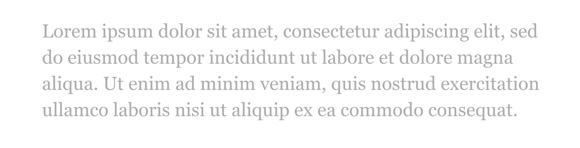
In the example below, the text has a contrast ratio of 2.4:1 against its background, and is difficult to read for some customers.
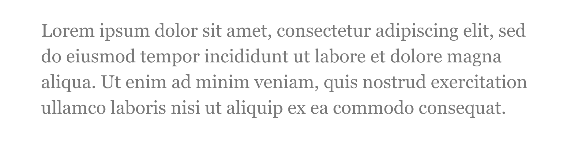
In the next example, the text has a contrast ratio of 4.8:1, and is easier to read for many customers.
Test the contrast of all text, including body text, headings, links, and form fields. Use the following guidelines:
- The color of body text and button text has a contrast ratio of at least 4.5:1 against its background.
- The color of headings and other large text (font size 24 px and up) has a contrast ratio of at least 3:1 against its background.
- The color of all text over images, including slideshows, banners, and videos, has sufficient contrast ratios against its background. For large text (font size 24 px and up), the contrast is at least 3:1. For smaller text the contrast is at least 4.5:1.
- The color of non-text elements, including input borders and icons, has a contrast ratio of at least 3:1 against its background.
Text headings
When you add headings to your page with the rich text editor, it's important to keep them in sequential order (1 - 6). Headings are used by assistive technologies to communicate how page content is organized. Skipping over levels, such as a heading level 2 followed by a heading level 4, can be confusing to users. Use the following guideline:
- Headings are used in sequential order and don't skip over levels.
Text size and alignment
When you edit your theme's typography settings, make sure that your text is large enough for customers to comfortably read.
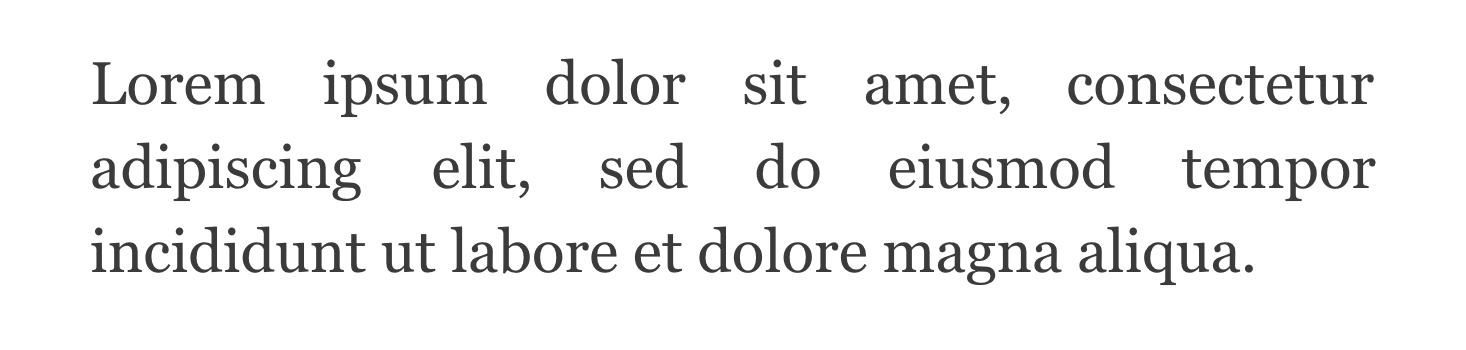
Text should also have consistent spacing between words and letters to make it easy to read. In the example below, the text alignment is justified, which creates inconsistent spacing between words.
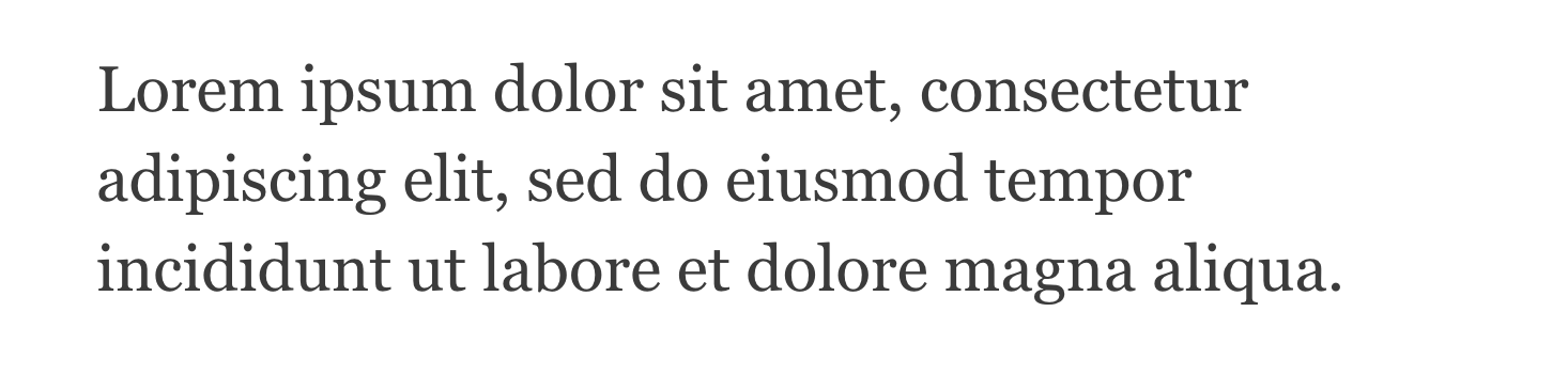
In the next example, the text alignment is left-aligned, which creates consistent spacing between words.
When customizing the size and alignment of text, use the following guidelines:
- The minimum font size for body text is the equivalent of 16 px.
- Text alignment isn't justified. Justified text creates inconsistent spacing between words.
Text links
Text links should be underlined or have another visually distinct style compared to regular text. Because some customers have trouble seeing color, you can't rely on a change in color alone to differentiate a link from regular text.
Text links should open in the same tab. Links that open in a new tab or window can cause confusion, especially on mobile where the old window isn't visible, and aren't inclusive to customers, especially customers that use screen magnification or are less technical.
If you edit your theme's stylesheet, then make sure that you don't remove text link styles. Use the following guidelines:
- Text links are either underlined or have another visual differentiator that's not just color so that customers can differentiate links from regular text.
- Text links open in the same tab when clicked.
Alternative text for images
When you add images to your online store, it's important to make them accessible to customers who are blind or have low vision. You can do this by adding alternative text that accurately describes each image. Customers who use screen readers rely on alt text to communicate the content of images on your online store.
You can add alt text to your product images from the Shopify admin. You can add alt text to the other images in your theme from the theme editor.
When you add alt text to an image, a good practice is to pretend that you're describing the image to someone who has their eyes closed. Help them to create an image in their mind. The way that you describe an image also depends on the context of your web page. For example, you might describe an image differently if your business is a travel agency than if your business is an outdoor equipment store. Consider the following image:

For a travel agency, you might refer to the country and region in which the two friends are traveling, and to the name of the ocean or sea that they're looking at. On the other hand, for an outdoor equipment store, you might focus on the brands and features of the two friends' backpacks.
If your business is a travel agency, then an example of poor alt text might be, "Two people in front of the ocean." For the same agency, an example of good alt text might be, "Two friends traveling in Lagos, Portugal, looking out at the sandy cove of Praia do Camilo on a sunny day."
Slideshow and video accessibility
When you add videos to your online store, make sure that you consider the needs of customers with low vision, customers who are deaf or hard of hearing, or customers who might be susceptible to vestibular disorders.
Some of these customers rely on the text to speech capability of screen readers, which read aloud the contents of a web page. Additional audio from videos and music, especially when it's unexpected, can make this experience difficult. For customers who are deaf or hard of hearing, it's a good idea to add closed captioning to your videos so that those customers can access the content.
Customers with vestibular disorders can experience dizziness with moving content. Because of this, it's important that slideshows and videos don't play automatically and that the customer can control the slideshow with control buttons.
Slideshows
When you add a slideshow to your online store, use the following guidelines:
- Slideshows don't play automatically.
- If slideshows do play automatically, then they include slideshow controls that customers can use to pause, advance, or stop the slideshow.
Videos
When you add a video to your online store, use the following guidelines:
- Videos don't play automatically.
- If videos do play automatically, then their audio is muted.
- For videos that include audio, the video is fully visible and not obstructed by other page elements. This allows closed captions to remain visible.
- For videos that include dialogue, text transcripts are available. These are included either on the page, or in a link to a separate page.
These guidelines also apply to videos that are in a slideshow.
Keyboard support
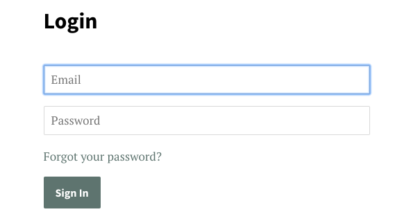
Customers with vision or motor impairment might use a keyboard to navigate and complete tasks online. These customers rely on a visual indicator to communicate where their keyboard’s focus is on a web page. In the example below, the Email field has a visual focus indicator:
If you edit your theme's stylesheet, then make sure that you don't remove the keyboard focus style from any page elements. Use the following guideline:
- All interactive page elements have a clear visual indicator when they have keyboard focus. These elements include links, buttons, and form fields.
Resources
To learn more about web accessibility for the topics discussed in this article, refer to the following resources.
Color contrast resources
- Colors with Good Contrast, an article from the Web Accessibility Initiative
- Contrast Ratio, an online tool that you can use to find the contrast ratio between two colors
- Color Contrast Analyzer, a contrast ratio application for download that was developed by the Paciello Group
Text resources
- 16 Pixels Font Size: For Body Copy. Anything Less Is A Costly Mistake, an article from Smashing Magazine
- Text alignment, an article from Web AIM
- Link Appearance, an article from Web AIM
- Using Headings for Content Structure, an article from Web AIM
Alternative text resources
- Text to Speech, an article from the Web Accessibility Initiative
- Alternative Text, an article from Web AIM
- Considerations when writing alt text, an article on Medium.
Slideshow and video resources
- A Primer to Vestibular Disorders, an article from The A11Y Project
- Text to Speech, an article from the Web Accessibility Initiative
- Video Captions, an article from the Web Accessibility Initiative
- Use automatic captioning, an article from YouTube Help
- Captions and subtitles, an article from the Vimeo Help Center
- Carousel usability, an article from the Nielsen Norman Group
Keyboard support resources
- Keyboard Compatibility, an article from the Web Accessibility Initiative
- Introduction to Focus, an article from Google Developers