เพิ่มตารางขนาดไปยังหน้าสินค้า
หากคุณขายเสื้อผ้าที่ลูกค้าต้องทราบขนาดก่อนทำการซื้อ คุณก็สามารถเพิ่มตารางขนาดแบบกำหนดเองไปยังหน้าสินค้าของคุณได้
สินค้าทั้งหมดที่ต้องอ้างอิงถึงตารางขนาดจะต้องมีตัวเลือกขนาด: 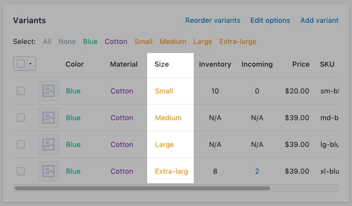
ในหน้านี้
การสร้างหน้าตารางขนาด
- จากส่วนผู้ดูแล Shopify ให้ไปที่ร้านค้าออนไลน์ > หน้า
- คลิกเพิ่มหน้า
-
ป้อนชื่อหน้า
- หากคุณต้องการสร้างตารางขนาดที่ปรากฏทั่วทั้งเว็บไซต์ ให้ป้อน
Size Chartสำหรับชื่อหน้าในส่วนตัวอย่างรายการเครื่องมือค้นหา URL* ของหน้าควรลงท้ายด้วย/size-chart - หากคุณต้องการสร้างตารางที่ปรากฏเฉพาะบนสินค้าจากเวนเดอร์รายใดรายหนึ่งเท่านั้น ให้ป้อนชื่อเวนเดอร์ตามด้วย
Size Chart
ตัวอย่างเช่น หากเวนเดอร์ของคุณชื่อ Great Owls ให้ป้อนGreat Owls Size Chartสำหรับชื่อหน้านั้น ในส่วนตัวอย่างรายการเครื่องมือค้นหา URL ของหน้าควรลงท้ายด้วย/great-owls-size-chart - หากคุณต้องการสร้างตารางที่จะปรากฏบนสินค้าบางประเภทเท่านั้น ให้ป้อนประเภทสินค้าตามด้วย
Size Chart
ตัวอย่างเช่น หากคุณต้องการแสดงตารางขนาดเฉพาะให้รองเท้า ให้ป้อนShoes Size Chartสำหรับชื่อหน้านั้น ในส่วนตัวอย่างรายการเครื่องมือค้นหา URL ของหน้าควรลงท้ายด้วย/shoes-size-chart
- หากคุณต้องการสร้างตารางขนาดที่ปรากฏทั่วทั้งเว็บไซต์ ให้ป้อน
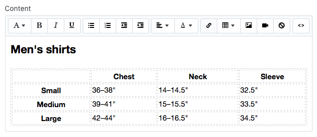
ในกล่องเนื้อหา ให้สร้างตารางที่มีข้อมูลตารางขนาดของคุณแล้วจึงปรับแต่งตารางให้มีลักษณะตามที่คุณต้องการ:
ในส่วนการแสดงผล ให้ตรวจสอบให้แน่ใจว่าตั้งค่าหน้าเป็น “แสดง” แล้ว
คลิกที่ “บันทึก”
- จากแอป Shopify ให้แตะที่ปุ่ม …
- ในส่วนช่องทางการขาย ให้แตะที่ร้านค้าออนไลน์
- แตะหน้า
- คลิกเพิ่มหน้า
-
ป้อนชื่อหน้า
- หากคุณต้องการสร้างตารางขนาดที่ปรากฏทั่วทั้งเว็บไซต์ ให้ป้อน
Size Chartสำหรับชื่อหน้าในส่วนตัวอย่างรายการเครื่องมือค้นหา URL* ของหน้าควรลงท้ายด้วย/size-chart - หากคุณต้องการสร้างตารางที่ปรากฏเฉพาะบนสินค้าจากเวนเดอร์รายใดรายหนึ่งเท่านั้น ให้ป้อนชื่อเวนเดอร์ตามด้วย
Size Chart
ตัวอย่างเช่น หากเวนเดอร์ของคุณชื่อ Great Owls ให้ป้อนGreat Owls Size Chartสำหรับชื่อหน้านั้น ในส่วนตัวอย่างรายการเครื่องมือค้นหา URL ของหน้าควรลงท้ายด้วย/great-owls-size-chart - หากคุณต้องการสร้างตารางที่จะปรากฏบนสินค้าบางประเภทเท่านั้น ให้ป้อนประเภทสินค้าตามด้วย
Size Chart
ตัวอย่างเช่น หากคุณต้องการแสดงตารางขนาดเฉพาะให้รองเท้า ให้ป้อนShoes Size Chartสำหรับชื่อหน้านั้น ในส่วนตัวอย่างรายการเครื่องมือค้นหา URL ของหน้าควรลงท้ายด้วย/shoes-size-chart
- หากคุณต้องการสร้างตารางขนาดที่ปรากฏทั่วทั้งเว็บไซต์ ให้ป้อน
ในกล่องเนื้อหา ให้สร้างตารางที่มีข้อมูลตารางขนาดของคุณแล้วจึงปรับแต่งตารางให้มีลักษณะตามที่คุณต้องการ:
ในส่วนการแสดงผล ให้ตรวจสอบให้แน่ใจว่าตั้งค่าหน้าเป็น “แสดง” แล้ว
คลิกที่ “บันทึก”
ไปที่ตัวแก้ไขโค้ด
- ในส่วนผู้ดูแล Shopify ให้ไปที่ร้านค้าออนไลน์ > ธีม
- ค้นหาธีมที่คุณต้องการแก้ไข แล้วคลิกปุ่ม … เพื่อเปิดเมนูดำเนินการ จากนั้นคลิก แก้ไขโค้ด
- จากแอป Shopify ให้แตะที่ปุ่ม …
- ในส่วนช่องทางการขาย ให้แตะที่ร้านค้าออนไลน์
- แตะจัดการธีม
- ค้นหาธีมที่คุณต้องการแก้ไข แล้วคลิกปุ่ม … เพื่อเปิดเมนูดำเนินการ จากนั้นคลิก แก้ไขโค้ด
- จากแอป Shopify ให้แตะที่ปุ่ม …
- ในส่วนช่องทางการขาย ให้แตะที่ร้านค้าออนไลน์
- แตะจัดการธีม
- ค้นหาธีมที่คุณต้องการแก้ไข แล้วคลิกปุ่ม … เพื่อเปิดเมนูดำเนินการ จากนั้นคลิก แก้ไขโค้ด
เลือกอย่างใดอย่างหนึ่งต่อไปนี้และสร้างส่วนย่อยของตารางขนาด
การสร้างส่วนย่อยของตารางขนาด
- ในไดเรกทอรีส่วนย่อย ให้คลิก เพิ่มส่วนย่อยใหม่
ตั้งชื่อส่วนย่อย
size-chartแล้วคลิกที่ “สร้างส่วนย่อย”:คัดลอกข้อความต่อไปนี้ไปยังส่วนย่อย
size-chartของคุณ:
<div class="pop-up-modal">
<div class="pop-up-content">
<span class="close-button">×</span>
<span class="size-chart-content">{{ pages.size-chart.content }}</span>
</div>
</div>
<script>
const modal = document.querySelector('.pop-up-modal');
const trigger = document.querySelector('.trigger-pop-up');
const closeButton = document.querySelector('.close-button');
function toggleModal() {
modal.classList.toggle('show-pop-up');
}
function windowOnClick(event) {
if (event.target === modal) {
toggleModal();
}
}
trigger.addEventListener('click', toggleModal);
closeButton.addEventListener('click', toggleModal);
window.addEventListener('click', windowOnClick);
</script>
<style>
.pop-up-modal {
position: fixed;
left: 0;
top: 0;
width: 100%;
height: 100%;
background-color: rgba(0, 0, 0, 0.5);
opacity: 0;
display: none;
transform: scale(1.1);
transition: visibility 0s linear 0.25s, opacity 0.25s 0s, transform 0.25s;
overflow:auto;
}
.pop-up-content {
position: absolute;
top: 8%;
left: 50%;
transform: translate(-50%, 0);
background-color: white;
padding: 1rem 1.5rem;
width: auto;
border-radius: 0.5rem;
}
.pop-up-content table {
table-layout: auto;
}
.close-button {
float: right;
width: 1.5rem;
line-height: 1.5rem;
text-align: center;
cursor: pointer;
border-radius: 0.25rem;
background-color: lightgray;
}
.close-button:hover {
background-color: darkgray;
}
.show-pop-up {
z-index: 12;
opacity: 1;
display: block;
transform: scale(1);
transition: visibility 0s linear 0s, opacity 0.25s 0s, transform 0.25s;
}
.trigger-pop-up {
margin: 10px 0 10px 0;
width: 100%;
}
@media only screen and (max-width: 749px) {
.pop-up-content,
.size-chart-content table {
width: 100%;
}
.size-chart-content th,
.size-chart-content td {
padding: 10px;
}
}
</style>{% block "note" %} มีการเปลี่ยนแปลงบางอย่างที่คุณต้องแก้ไขในการจัดรูปแบบ CSS สำหรับธีม Simple และ Minimal {% endblock %}
หากคุณใช้ธีม Simple ให้ใช้รหัสนี้:
<div class="pop-up-modal">
<div class="pop-up-content">
<span class="close-button">×</span>
<span class="size-chart-content">{{ pages.size-chart.content }}</span>
</div>
</div>
<script>
const modal = document.querySelector('.pop-up-modal');
const trigger = document.querySelector('.trigger-pop-up');
const closeButton = document.querySelector('.close-button');
function toggleModal() {
modal.classList.toggle('show-pop-up');
}
function windowOnClick(event) {
if (event.target === modal) {
toggleModal();
}
}
trigger.addEventListener('click', toggleModal);
closeButton.addEventListener('click', toggleModal);
window.addEventListener('click', windowOnClick);
</script>
<style>
.pop-up-modal {
position: fixed;
left: 0;
top: 0;
width: 100%;
height: 100%;
background-color: rgba(0, 0, 0, 0.5);
opacity: 0;
display: none;
transform: scale(1.1);
transition: visibility 0s linear 0.25s, opacity 0.25s 0s, transform 0.25s;
overflow:auto;
}
.pop-up-content {
position: absolute;
top: 8%;
left: 50%;
transform: translate(-50%, 0);
background-color: white;
padding: 1rem 1.5rem;
width: auto;
border-radius: 0.5rem;
}
.pop-up-content table {
table-layout: auto;
}
.close-button {
float: right;
width: 1.5rem;
line-height: 1.5rem;
text-align: center;
cursor: pointer;
border-radius: 0.25rem;
background-color: lightgray;
}
.close-button:hover {
background-color: darkgray;
}
.show-pop-up {
z-index: 12;
opacity: 1;
display: block;
transform: scale(1);
transition: visibility 0s linear 0s, opacity 0.25s 0s, transform 0.25s;
}
.trigger-pop-up {
margin: 10px 0 10px 8px;
width: 50%;
}
@media only screen and (max-width: 749px) {
.pop-up-content,
.size-chart-content table {
width: 100%;
}
.size-chart-content th,
.size-chart-content td {
padding: 10px;
}
.trigger-pop-up {
width: 100%;
}
}
</style>หากคุณใช้ธีม Minimal ให้ใช้รหัสต่อไปนี้:
<div class="pop-up-modal">
<div class="pop-up-content">
<span class="close-button">×</span>
<span class="size-chart-content">{{ pages.size-chart.content }}</span>
</div>
</div>
<script>
const modal = document.querySelector('.pop-up-modal');
const trigger = document.querySelector('.trigger-pop-up');
const closeButton = document.querySelector('.close-button');
function toggleModal() {
modal.classList.toggle('show-pop-up');
}
function windowOnClick(event) {
if (event.target === modal) {
toggleModal();
}
}
trigger.addEventListener('click', toggleModal);
closeButton.addEventListener('click', toggleModal);
window.addEventListener('click', windowOnClick);
</script>
<style>
.pop-up-modal {
position: fixed;
left: 0;
top: 0;
width: 100%;
height: 100%;
background-color: rgba(0, 0, 0, 0.5);
opacity: 0;
display: none;
transform: scale(1.1);
transition: visibility 0s linear 0.25s, opacity 0.25s 0s, transform 0.25s;
overflow:auto;
}
.pop-up-content {
position: absolute;
top: 8%;
left: 50%;
transform: translate(-50%, 0);
background-color: white;
padding: 1rem 1.5rem;
width: auto;
border-radius: 0.5rem;
}
.pop-up-content table {
table-layout: auto;
}
.close-button {
float: right;
width: 1.5rem;
line-height: 1.5rem;
text-align: center;
cursor: pointer;
border-radius: 0.25rem;
background-color: lightgray;
}
.close-button:hover {
background-color: darkgray;
}
.show-pop-up {
z-index: 12;
opacity: 1;
display: block;
transform: scale(1);
transition: visibility 0s linear 0s, opacity 0.25s 0s, transform 0.25s;
}
.trigger-pop-up {
margin: 10px 0 10px 0;
width: 100%;
}
@media only screen and (max-width: 749px) {
.pop-up-content,
.size-chart-content table {
width: 100%;
}
.size-chart-content th,
.size-chart-content td {
padding: 10px;
}
}
@media only screen and (min-width: 750px) {
.trigger-pop-up {
width: 50%;
}
}
</style>เพิ่มส่วนย่อยของตารางขนาดลงใน theme.liquid ของคุณ
- ในไดเรกทอรีเลย์เอาต์ ให้คลิกเพื่อเปิดไฟล์
theme.liquidของคุณ - ค้นหาแท็กปิด
</body>แล้ววางโค้ดต่อไปนี้เหนือแท็กปิด</body>
{% if request.page_type == 'product' %}
    {% if product.options contains 'Size' %}
        {% render 'size-chart' %}
    {% endif %}
{% endif %}เพิ่มปุ่มตารางขนาด
- ในไดเรกทอรีส่วน ให้คลิกเพื่อเปิดไฟล์
product-template.liquidหรือเปิดไฟล์product.liquidหากคุณไม่มีไฟล์product-template.liquid - วางโค้ดต่อไปนี้เหนือปุ่มเพิ่มลงในตะกร้าสินค้า:
{% if product.options contains 'Size' %}
    <a class="trigger-pop-up btn">See Size Chart</a>
{% endif %}
โดยทั่วไปแล้ว ปุ่มเพิ่มลงในตะกร้าสินค้าจะขึ้นต้นด้วย <button type="submit" name="add" หากภาษาที่ใช้ดําเนินการของร้านค้าคุณไม่ใช่ภาษาอังกฤษ ให้แทนที่ See Size Chart ด้วยข้อความที่คุณต้องการใช้
การสร้างส่วนย่อยของตารางขนาด
- ในไดเรกทอรีส่วนย่อย ให้คลิก เพิ่มส่วนย่อยใหม่
ตั้งชื่อส่วนย่อย
size-chartแล้วคลิกที่ “สร้างส่วนย่อย”:คัดลอกข้อความต่อไปนี้ไปยังส่วนย่อย
size-chartของคุณ:
{% assign chart = product.type | handleize | append: "-size-chart" %} {% unless
pages[chart].empty? or pages[chart].content == blank %}
<div class="pop-up-modal">
<div class="pop-up-content">
<span class="close-button">×</span>
<span class="size-chart-content">{{ pages[chart].content }}</span>
</div>
</div>
{% endunless %}
<script>
const modal = document.querySelector('.pop-up-modal');
const trigger = document.querySelector('.trigger-pop-up');
const closeButton = document.querySelector('.close-button');
function toggleModal() {
modal.classList.toggle('show-pop-up');
}
function windowOnClick(event) {
if (event.target === modal) {
toggleModal();
}
}
trigger.addEventListener('click', toggleModal);
closeButton.addEventListener('click', toggleModal);
window.addEventListener('click', windowOnClick);
</script>
<style>
.pop-up-modal {
position: fixed;
left: 0;
top: 0;
width: 100%;
height: 100%;
background-color: rgba(0, 0, 0, 0.5);
opacity: 0;
display: none;
transform: scale(1.1);
transition: visibility 0s linear 0.25s, opacity 0.25s 0s, transform 0.25s;
overflow:auto;
}
.pop-up-content {
position: absolute;
top: 8%;
left: 50%;
transform: translate(-50%, 0);
background-color: white;
padding: 1rem 1.5rem;
width: auto;
border-radius: 0.5rem;
}
.pop-up-content table {
table-layout: auto;
}
.close-button {
float: right;
width: 1.5rem;
line-height: 1.5rem;
text-align: center;
cursor: pointer;
border-radius: 0.25rem;
background-color: lightgray;
}
.close-button:hover {
background-color: darkgray;
}
.show-pop-up {
z-index: 12;
opacity: 1;
display: block;
transform: scale(1);
transition: visibility 0s linear 0s, opacity 0.25s 0s, transform 0.25s;
}
.trigger-pop-up {
margin: 10px 0 10px 0;
width: 100%;
}
@media only screen and (max-width: 749px) {
.pop-up-content,
.size-chart-content table {
width: 100%;
}
.size-chart-content th,
.size-chart-content td {
padding: 10px;
}
}
</style>หากคุณกำลังใช้ธีม Simple ให้เปลี่ยนตำแหน่งโค้ด .trigger-pop-up ไปไว้ด้านบนของ </style> แล้วแทนที่ด้วยโค้ดต่อไปนี้:
.trigger-pop-up {
  margin: 10px 0 10px 8px;
  width: 50%;
}
@media only screen and (max-width: 749px) {
  .pop-up-content,
  .size-chart-content table {
    width: 100%;
  }
  .size-chart-content th,
  .size-chart-content td {
    padding: 10px;
  }
  .trigger-pop-up {
    width: 100%;
  }
}
หากคุณกำลังใช้ธีม Minimal ให้เพิ่มโค้ดต่อไปนี้เหนือแท็กปิด </style>:
@media only screen and (min-width: 750px) {
  .trigger-pop-up {
    width: 50%;
  }
}
เพิ่มส่วนย่อยของตารางขนาดลงใน theme.liquid ของคุณ
- ในไดเรกทอรีเลย์เอาต์ ให้คลิกเพื่อเปิดไฟล์
theme.liquidของคุณ - ค้นหาแท็กปิด
</body>แล้ววางโค้ดต่อไปนี้เหนือแท็กปิด</body>
{% if request.page_type == 'product' %}
    {% if product.options contains 'Size' %}
      {% assign chart = product.type | handleize | append: "-size-chart" %}
      {% unless pages[chart].empty? or pages[chart].content == blank %}
        {% render 'size-chart' %}
      {% endunless %}
    {% endif %}
{% endif %}เพิ่มปุ่มตารางขนาด
- ในไดเรกทอรีส่วน ให้คลิกเพื่อเปิดไฟล์
product-template.liquidหรือเปิดไฟล์product.liquidหากคุณไม่มีไฟล์product-template.liquid - วางโค้ดต่อไปนี้เหนือปุ่มเพิ่มลงในตะกร้าสินค้า:
{% if product.options contains 'Size' %}
      {% assign chart = product.type | handleize | append: "-size-chart" %}
      {% unless pages[chart].empty? or pages[chart].content == blank %}
        <a class="trigger-pop-up btn">See Size Chart</a>
      {% endunless %}
    {% endif %}
โดยทั่วไปแล้ว ปุ่มเพิ่มลงในตะกร้าสินค้าจะขึ้นต้นด้วย <button type="submit" name="add" หากภาษาที่ใช้ดําเนินการของร้านค้าคุณไม่ใช่ภาษาอังกฤษ ให้แทนที่ See Size Chart ด้วยข้อความที่คุณต้องการใช้
การสร้างส่วนย่อยของตารางขนาด
- ในไดเรกทอรีส่วนย่อย ให้คลิก เพิ่มส่วนย่อยใหม่
ตั้งชื่อส่วนย่อย
size-chartแล้วคลิกที่ “สร้างส่วนย่อย”:คัดลอกข้อความต่อไปนี้ไปยังส่วนย่อย
size-chartของคุณ:
{% assign chart = product.vendor | handleize | append: "-size-chart" %} {%
unless pages[chart].empty? or pages[chart].content == blank %}
<div class="pop-up-modal">
<div class="pop-up-content">
<span class="close-button">×</span>
<span class="size-chart-content">{{ pages[chart].content }}</span>
</div>
</div>
{% endunless %}
<script>
const modal = document.querySelector('.pop-up-modal');
const trigger = document.querySelector('.trigger-pop-up');
const closeButton = document.querySelector('.close-button');
function toggleModal() {
modal.classList.toggle('show-pop-up');
}
function windowOnClick(event) {
if (event.target === modal) {
toggleModal();
}
}
trigger.addEventListener('click', toggleModal);
closeButton.addEventListener('click', toggleModal);
window.addEventListener('click', windowOnClick);
</script>
<style>
.pop-up-modal {
position: fixed;
left: 0;
top: 0;
width: 100%;
height: 100%;
background-color: rgba(0, 0, 0, 0.5);
opacity: 0;
display: none;
transform: scale(1.1);
transition: visibility 0s linear 0.25s, opacity 0.25s 0s, transform 0.25s;
overflow:auto;
}
.pop-up-content {
position: absolute;
top: 8%;
left: 50%;
transform: translate(-50%, 0);
background-color: white;
padding: 1rem 1.5rem;
width: auto;
border-radius: 0.5rem;
}
.pop-up-content table {
table-layout: auto;
}
.close-button {
float: right;
width: 1.5rem;
line-height: 1.5rem;
text-align: center;
cursor: pointer;
border-radius: 0.25rem;
background-color: lightgray;
}
.close-button:hover {
background-color: darkgray;
}
.show-pop-up {
z-index: 12;
opacity: 1;
display: block;
transform: scale(1);
transition: visibility 0s linear 0s, opacity 0.25s 0s, transform 0.25s;
}
.trigger-pop-up {
margin: 10px 0 10px 0;
width: 100%;
}
@media only screen and (max-width: 749px) {
.pop-up-content,
.size-chart-content table {
width: 100%;
}
.size-chart-content th,
.size-chart-content td {
padding: 10px;
}
}
</style>หากคุณกำลังใช้ธีม Simple ให้เปลี่ยนตำแหน่งโค้ด .trigger-pop-up ไปไว้ด้านบนของ </style> แล้วแทนที่ด้วยโค้ดต่อไปนี้:
.trigger-pop-up {
  margin: 10px 0 10px 8px;
  width: 50%;
}
@media only screen and (max-width: 749px) {
  .pop-up-content,
  .size-chart-content table {
    width: 100%;
  }
  .size-chart-content th,
  .size-chart-content td {
    padding: 10px;
  }
  .trigger-pop-up {
    width: 100%;
  }
}
หากคุณกำลังใช้ธีม Minimal ให้เพิ่มโค้ดต่อไปนี้เหนือแท็กปิด </style>:
@media only screen and (min-width: 750px) {
  .trigger-pop-up {
    width: 50%;
  }
}
เพิ่มส่วนย่อยของตารางขนาดลงใน theme.liquid ของคุณ
- ในไดเรกทอรีเลย์เอาต์ ให้คลิกเพื่อเปิดไฟล์
theme.liquidของคุณ - ค้นหาแท็กปิด
</body>แล้ววางโค้ดต่อไปนี้เหนือแท็กปิด</body>
{% if request.page_type == 'product' %}
    {% if product.options contains 'Size' %}
      {% assign chart = product.vendor | handleize | append: "-size-chart" %}
      {% unless pages[chart].empty? or pages[chart].content == blank %}
        {% render 'size-chart' %}
      {% endunless %}
    {% endif %}
{% endif %}เพิ่มปุ่มตารางขนาด
- ในไดเรกทอรีส่วน ให้คลิกเพื่อเปิดไฟล์
product-template.liquidหรือเปิดไฟล์product.liquidหากคุณไม่มีไฟล์product-template.liquid - วางโค้ดต่อไปนี้เหนือปุ่มเพิ่มลงในตะกร้าสินค้า:
{% if product.options contains 'Size' %}
      {% assign chart = product.vendor | handleize | append: "-size-chart" %}
      {% unless pages[chart].empty? or pages[chart].content == blank %}
        <a class="trigger-pop-up btn">See Size Chart</a>
      {% endunless %}
    {% endif %}
โดยทั่วไปแล้ว ปุ่มเพิ่มลงในตะกร้าสินค้าจะขึ้นต้นด้วย <button type="submit" name="add" หากภาษาที่ใช้ดําเนินการของร้านค้าคุณไม่ใช่ภาษาอังกฤษ ให้แทนที่ See Size Chart ด้วยข้อความที่คุณต้องการใช้